Showing posts with label Essie. Show all posts

Thursday, March 19, 2015

Essie Fiji nail polish review + swatches


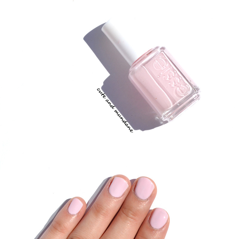
           I'd bet that most of us have the one shade of lacquer we just can't seem to stop collecting; for me it's pale pink. I must have at least ten (probably more) shades of Essie pinks alone, that would look practically identical to the casual observer. But to me, they're all so very different - with different nuances, sheerness, or even subtle sparkle! Different times of the year, and different occasions seem to call for different pale pinks. As of late, my pink of choice has been Essie Fiji.

         Essie Fiji is an interesting choice, as it's not one of my usual go-tos. It has the slightest touch of warmth that makes it a bit more sweet-tart than chic. For this reason, I generally prefer my 'cooler' BFF Essie Minimalistic (reviewed) when I want a pale pink. That said, there's something about early spring that calls for candied tones!


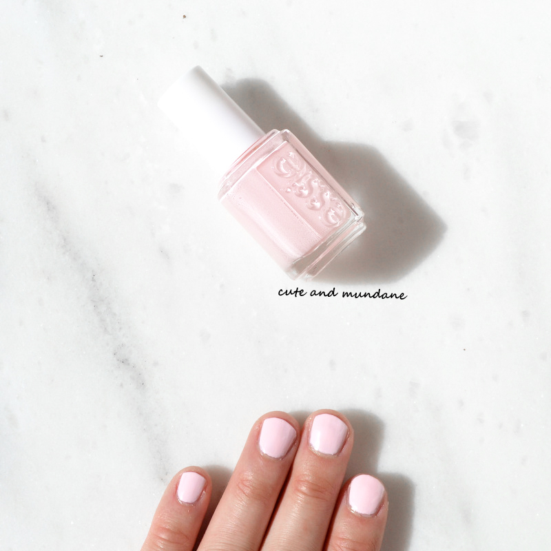
          Essie Fiji is an opaque pastel pink. It's every so slightly a yellow-pink, which gives it the candied character I mentioned above. The formula is decent, though not the best of my Essie Pinks; my main issue is that it doesn't level / even out as well as some of my other Essie polishes, despite having a steady hand. You could get coverage with two well placed coats, but I find that three thin coats works best to achieve even, full coverage.


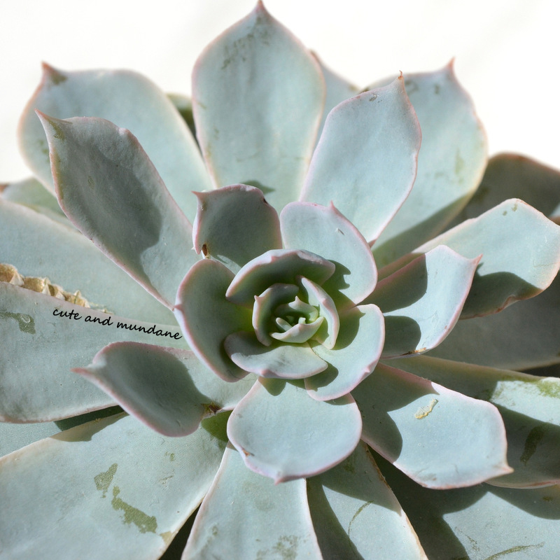
        As a quick aside - I had to share a picture of my Echeveria subsessilis. It's one of my favorite new additions to my succulent collection. I love the pretty pink tips contrasted against the dusty blue leaves - such a perfect combination for spring!


          In terms of comparison swatches, I'm sharing the same set of shades as a previous post, as they really demonstrate the nuances between the different opaque pink cremes in my collection. Essie French Affair has more pink-lavender leanings. Essie Neo Whimsical is darker. Essie Minimalistic (reviewed here) is very similar, but cooler - and a bit more undertone free. Essie Not Just a Pretty Face is a warmer beige pink.


           Overall, Essie Fiji is a sweet pink shade that works so well during early spring! It's not my year-round pink, but a fun shade to have in my collection. That said, I can see how those with more warmth in skin-tone might be able to pull it off on the regular. If you've tried Essie Fiji, let me know how it's worked for you!

         Thanks for reading! What lacquers are you wearing lately? What Essie Pinks are your favorites?

Love, Dovey.

Sunday, October 5, 2014

Essie Minimalistic nail polish review + swatches


         If you need your daily dose of pink, this pink polish post is for you! When it comes to staple shades like pink, I tend to collect a number of nuances. After all polish preferences such as shade, shimmer, and sheerness change depending on the season.  Around this time of year, I shed the sheers and reach for opaque cremes, a la Essie Minimalistic.


Essie Minimalistic nail polish
       Essie Minimalistic is an opaque pale pink creme. It has a clean feel with neutral to cool undertones. Usually two coats is sufficient for full effect.


My collection of light pink Essie polishes! (I'll try to do a post with my Essie pink sheers someday...)
          I've compared Essie Minimalistic to opaque pink Essie creme polishes in my collection. Essie French Affair is darker and cooler, with lavender tones. Essie Neo Whimsical is darker and also has some lavender tones mixed in. Essie Fiji is the most similar polish to Minimalistic; that said, it is a warmer pink. Essie Not Just A Pretty Face is darker and much warmer with beige undertones.

            Essie Minimalistic is one of my favorite Essie pinks. I love how pale and  clean the color is; it doesn't have lavender, coral, or beige undertones, as many pinks often do. It's surprising how much a small change in undertone can affect overall appearance. I personally find Essie Minimalistic to be generally more wearable for me than Essie Fiji, though it's hard to tell which one's which at first glance!

          Thanks for reading! What are your favorite pink polishes? What Essie pinks do you have in your collection?

Love, Dovey.

Saturday, January 11, 2014

Essie Jazzy Jubilant and Essie Sparkle On Top (Luxeffects collection) review + swatches


           'Tis the season for sparkle and shine, whether from twinkling snowflakes skirting windy drifts, or colorful fluttering confetti heralding the New Year in Times Square. It's the perfect time to add a little twinkle to the 'tips, no? With this in mind, I've been experimenting with Essie Jazzy Jubilant and Essie Sparkle on Top, courtesy of Essie. These two glittering topcoats are the newest additions to the Essie luxeffects collection!


         As its moniker suggests, Essie Jazzy Jubilant is a celebration in itself! Multicolor glitter in electric blue, orchid, silver, and cherry fills this confetti-like concoction. Three different sizes of glitter give the top coat nice variation and depth.

          Essie Sparkle on Top is filled with iridescent, luminescent flakes that brush on to give it an ice-crystal effect. The iridescence leans cool, flashing in pink, blue, and purple spectra. The formula is thicker, as there are quite a few flakes packed in!


         When it comes to showcasing glitter, there's nothing I like more than starting on a winter-white base. I've made my comparison swatches atop Essie Blanc. I was surprised to see that Essie Jazzy Jubilant is quite similar to Wet n Wild Party of Five Glitters. Both have a comparable variety of glitter sizes and colors. I'd say Essie Jazzy Jubilant contains a greater percentage of large glitter, and has more of a Mardi-Gras flavor from its greater emphasis on green/purple rather than red/pink. I was quite keen to compare Essie Sparkle on Top to Sally Hansen Hidden Treasure (a well known flaky shade from back in the day). The former had much larger and visible chunks of flakes giving it a geometric icicle-like effect. The latter has smaller, more uniform flakes. Essie Sparkle on Top flashes more purple, while Sally Hansen Hidden Treasure flashes more pink in a green base (Though I'm not sure if it was always greenish; it might be from natural color deterioration over time).

          Though I'm usually a creme polish person, it's fun to have some sparkly options in my collection! Essie Jazzy Jubilant is a very festive confetti, perfect for the new year (or even Mardi Gras, if you're looking ahead). I'm actually quite fond of the large icicle-like flakes in Essie Sparkle on Top. Over white, they make a nice crystalline effect that matches the snowy season.

       Thanks for reading! What shades of sparkle are you wearing on your tips this season? Do you prefer glitter or flakes?

Love, Dovey.
Disclosure: This post contains product(s) sent to Cute and Mundane for consideration. The ideas and opinions in this post are genuine and my own.

Wednesday, January 1, 2014

A clean slate...


           Happy New Year! There's something magical about January 1st - I just love the refreshing feeling of waking up to a brand new year, full of optimism and good will! It's also a great chance to reaffirm those old (and new) resolutions with a squeaky clean slate!

         Naturally, the colors I'm wearing at this new beginning reflect my sentiments. I've started 2014 with a couple coats of Essie Allure at my fingertips. This sheer white was a wonderful rediscovery from my stash; it was gifted to me by a dear friend some time ago. I also decided it was high time to switch out my well-worn wallet. I went from hot pink to this gorgeous white grain Kate Spade wallet (thanks mom!). In terms of makeup, I'm keeping things minimal with just a dusting of CHANEL Poudre Universelle in 20 Clair, with a liquid eyeliner, mascara, and a little aquaphor on the lips.

         Thanks for reading! I hope your New Year is off to a wonderful start! What beauty products and/or accessories are you refreshing your routine with today?

Love, Dovey.

Sunday, December 22, 2013

Essie Belugaria, Ignite the Night, and Lots of Lux review + swatches (Encrusted Treasures collection - Holiday 2013)


            Recently, a few delightful bottles from the Essie Encrusted Treasures collection (Holiday 2013) made it into my stocking, courtesy of Essie! These sparkly shades mirror the glitter of silvery tinsel on holiday wreaths and trees, including a coal-black reminder to always stay on the right side of the naughty-nice spectrum!  You'll notice from my review and swatches below that like tree trimmings, this collection is all about texture, texture, texture!

         The three shimmering shades I have from Essie Encrusted Treasures include : Belugaria, Ignite the Night, and Lots of Lux.

Essie Belugaria, a North Pole coal, encrusted with iridescent flakes.
         Essie Belugaria walks a fine line between bizarre and beautiful. The jet black caviar and chunky glitter-infused polish imparts an unapologetically three-dimensional texture to my tips. I quite like the effect, and I think it's flattering on my shorter, rounded nails. (Plus, you know I've been all about black polish lately). Essie Belugaria applies relatively smoothly despite the chunky texture; two thick coats does the trick. It's like painting on a chunk of North Pole coal, encrusted with ice crystals.


Essie Ignite the Night set my heart aglow with its miniature golden sparkles.
         Essie Ignite the Night is a glowing grey glitter that certainly sparked my fancy. There's more to this charming charcoal polish than meets the eye! At first glance, you'll see dense charcoal glitter. However, closer up, you'll see miniature micro-sparkles of gold, adding warmth and dimension to the silvery-grey backdrop. The effect is similar to that of the iconic CHANEL Vernis in Graphite (more on that below). The glitter is quite dense, so 2-3 coats are sufficient.

         Essie Lots of Lux is a medium blue glitter with a matte effect. The glitter is quite dense, and the polish dries down leaving more of a textured finish than a standard glossy finish. You'll see that Essie snuck in the same golden micro-glitter in here as well, adding a nice touch of warmth.


Essie Lots of Lux is matte, but certainly not flat!
          As usual, I've pulled a few polishes from my collection to better display the nuances in each polish. Essie Belugaria has an oh-so-unique texture that really shines up close. The closest decorated black I have is Sally Hansen Midnight in NY, which has really pretty iridescent sparkles; you can see it's much more subdued than the former! I mentioned above the similarities between Essie Ignite the Night and the iconic CHANEL Graphite. You can see that both have that wonderful charcoal with gold sheen. However the former has a bit grittier glitter, while the latter goes for a more micro-shimmer effect. Essie Lots of Lux is quite similar to Butter London Inky Six (reviewed here); it's a tad less purple and has a more matte, textured effect.


          The uniquely textured collection of polishes in Essie Encrusted Treasures (Holiday 2013) is a fun addition to the season of sparkle and shine. Essie Belugaria wins the award for the most unique polish I've seen in some time, though I'm most charmed by the glowing charcoal of Essie Ignite the Night!

        Thanks for reading! Which polish from Encrusted treasures strikes your fancy? What holiday glitters have you worn lately? What do you think of Essie Belugaria - bizarre or beautiful?

Love, Dovey.

P.S. Be sure to check out my review of the Essie Shearling Darling collection (Winter 2013)!
Disclosure: This post contains product(s) sent to Cute and Mundane for consideration. The ideas and opinions in this post are genuine and my own.

Friday, December 20, 2013

Essie Shearling Darling, Parka Perfect, and Mind Your Mittens nail polish review + swatches (Winter 2013)


          As a Chicagoan, I think it's fair to say that I've experienced my fair share of winter!  But even though icy winds and seeping cold dominate the winter experience, it's the sensation of warmth that truly defines it. There's something quite wonderful about stepping out into a cold, mid-December flurry bundled in a downy parka, shearling boots, and thick, woolen mittens, scurrying down the street into the inviting, oven-toasted warmth of my neighborhood's fragrant French bakery!

          To celebrate the season, Essie has created a collection of polishes with warm, fuzzy, wintry names. Today I have the creme shades from Essie Shearling Darling (Winter 2013) to share with you, courtesy of Essie!

I'm not one to resist a darling dark red like Essie Shearling Darling!
         Essie Shearling Darling, the namesake shade from the collection, is a gorgeous dark burgundy red creme polish. (You know how I feel about dark reds!) Of course, this was the first shade I applied from the collection, immediately upon receiving it.

Essie Parka Perfect is a beautiful watery glacier blue
          Essie Parka Perfect is a dusty grey-blue with barely perceptible shimmer. I think it's a lovely representation of melting snow (or perhaps a melting snowman?). I love the subtle tinting of this glacier blue; it evokes a sense of obscure, clouded depth behind a tranquil exterior. It was slightly tricky to apply, but the color was worth it.

          Essie Mind Your Mittens is a dark blue spruce. The teal blue conveys the dimly reflective shadows of evergreen hills, permeated by pallid winter light. The creme nail polish applied smoothly in 1-2 coats.
'Spruce'-ing things up with Essie Mind Your Mittens
           I've made a few comparison swatches to better show the nuances in my set of polishes from the Essie Shearling Darling collectionCHANEL Rouge Noir (reviewed here) is a dark, blackened crimson, while Shearling Darling is lighter and more brown (i.e. maroon). Essie Bordeaux, one of the oldest reds in my collection, is a much lighter shade of wine. Essie Mint Candy Apple is brighter, more candy colored, and more green than Essie Parka Perfect. Essie Rock The Boat (reviewed here) is more sky blue; you can appreciate the greenish tones in Essie Parka Perfect in the comparison. SpaRitual Basalt (reviewed here) has similar intensity, however it is more grey and less blue-green than Essie Mind Your MittensNARS Storm Bird (reviewed here) is lighter, again more grey, and less blue.


         This winter, I'm planning on delighting in my warmest winter wrappings, along with as many mocha lattes as I can get my hands on! Of course, a matching manicure à la Essie's Shearling Darling collection adds just the right touch to a warm winter ensemble. Of my three, Essie Shearling Darling steals my heart, however the glacier blue of Essie Parka Perfect is quite wonderful as well!

         Thanks for reading! Have you picked up any shades from Essie Shearling Darling (Winter 2013)? What Essie shades have you been loving lately?

Love, Dovey.

P.S. I have shades from Essie Encrusted Treasures (Holiday 2013) coming up next, so stay tuned!
Disclosure: This post contains product(s) sent to Cute and Mundane for consideration by PR. The ideas and opinions in this post are genuine and my own.

Tuesday, December 17, 2013

Works in progress... [a preview]


          Hello! I've been having some much needed fun road-tripping across the East Coast (a.k.a. my old stomping grounds) this week! Though I've been on the move, I do have a handful of works in progress to share in the very near future : a few fabulous shades from Essie (shown above), a little LUSH, and pretty Prada perfume to boot. Be sure to check back soon!

Love, Dovey.

Sunday, November 3, 2013

Literal Arts


              I'm very much a minimalist when it comes to self-decor. I prefer simple colors to speak for themselves, as opposed to donning a cacophony of chromaticities. I do, however, make an exception for the written word! There's something iconic about text; it can be a 'literal art' within itself. Lettering can be stylized in the inked flourishes of calligraphy, while textual arrangements can create fun formations, as seen here in Harper's Bazaar 'My List' (which happens to be among my favorite columns... or should I say circles?).

Butter London Union Jack Black and Essie Blanc
            Today I'm sharing photos of a simple nail look I wore this weekend, using words as art! It's a simple project, really. I used black and white for modern contrast. (Shown here are Butter London Union Jack Black* (reviewed here) and Essie Blanc*). I freehanded the letters, but I'm sure one could use an actual paintbrush for more control! To keep things from being over-the-top (i.e. staying minimalist), I kept my other hand letter-free for effect.


          I loved my simple little lettered mani! I'd venture to say the real fun is in picking  the actual word to paint. I was in the mood for Italian today with ciao, however, as you can imagine, the possibilities are endless!

          Thanks for reading! Have you worn a lettered mani? What message would you leave at your fingertips?

Love, Dovey.
*Disclosure: This post contains product(s) sent to Cute and Mundane for consideration. The ideas and opinions in this post are genuine and my own.

Friday, October 4, 2013

A few of my favorite things - October 2013


          Happy October! The combination of crisp air, colorful gourds, and candy corn make this my favorite month of the year! Beautiful, striking colors are lining the farm-side produce stands, glowing vermilion, white, and jack-o-lantern orange in the glancing afternoon sunlight. (snapshot by mom!) In commemoration of this final, colorful harvest of the year, I'd like to share a few of my favorite fall-themed accoutrements!

1. Vermilion sweater (St. John) + orange patterned blouse (GAP) - I paired a favorite vermilion sweater with an orange print, to mimic the complementary colors of the pumpkins.


2. OPI Did you 'ear about Van Gogh? (reviewed here) - This shade reminds me of wheat fields ready for harvest; it's an appropriate sentiment, given Van Gogh's proclivity for the subject in his artwork.

3. Essie nail polish in Blanc* -This color channels the pale white of the albino pumpkins, as well as little bedsheet phantasms that will appear on neighborhood sidewalks later on this month!

4. Dior Vernis in Riviera (reviewed here) -I find that sporting a bright vermilion is a chic alternative to classic jack-o-lantern orange this month.


5. CHANEL Double Perfection Lumière powder foundation - I'm proud to say I hit pan on this foundation! Needless to say, it's still getting a lot of love.

6.  Diptyque satchel - I love little logo pouches and was tickled when Mr. Lovey brought this one home for me. It's perfect for housing my collection of Diptyque perfume samples! (Be sure to check out my Diptyque perfume reviews here).

The perfect storage solution for my collection of Diptyque samples!
          I hope you enjoyed my ode to October! The combination of vermilion and white is a colorfully crisp variation on a fall theme that I'm going to enjoy incorporating into my routine this month. And of course, a dash of jack-o-lantern orange is always appropriate as well!

        Thanks for reading! What kind of colors and cosmetics are inspiring you this October?

Love, Dovey.
*Disclosure: This post contains product(s) sent to Cute and Mundane for consideration. The ideas and opinions in this post are genuine and my own.

Sunday, June 16, 2013

Essie Lovie Dovie nail polish review + comparison swatches


           I've coveted Essie Lovie Dovie for quite some time now --- after all it has a really great name, right? I've finally been able to add it to my collection, thanks to Essie, and have a review and swatches to share with you today! Essie Lovie Dovie is a light-to-medium pink creme that looks a lot like a vintage barbie slipper. OPI I Think In Pink nail polish is a much lighter pink than Essie Lovie Dovie. L'Oreal Trust Fund Baby is a warmer redder pink with shimmer. NARS Trouville (reviewed here) is a lighter and significantly warmer pink.


          Overall, I'd have to say Essie Lovie Dovie is a fun, girly pink. I'll definitely be adding it to my pink pedi rotation in the upcoming summer months! Thanks for reading! What Essie nail colors have you been loving lately? What are your favorite bright pinks?

Love, Dovey.
Disclosure: This post contains product(s) sent to Cute and Mundane for consideration. The ideas and opinions in this post are genuine and my own.   

Monday, June 3, 2013

Essie Rock The Boat and Essie Full Steam Ahead nail polish review + comparison swatches


         As someone who's spent a good portion of her life in New England, the thought of summer conjures up images of sailboats, embroidered shorts, and sailor stripes. When Essie Rock The Boat and Essie Full Steam Ahead from the Essie Naughty Nauticals nail polish collection for Summer 2013 landed on my desk courtesy of Essie, these cute and classic images of American summers spent waterside came to the forefront of my mind. I've been enjoying these two colors this past week and can't wait to share my review and comparison swatches with you today!


           Essie Full Steam Ahead is a light lavender, and Essie Rock the Boat is a light french blue with a hint of periwinkle. Both colors have a very subtle shimmer that you might not notice at first glance!


         I've made some comparison swatches below to give you a better idea of what Essie Rock The Boat and Essie Full Steam Ahead look like. You can see that Rock the Boat is much more periwinkle toned than the sky blues of Sephora by OPI Havana Dreams and OPI What's With The Cattitude?. It has the same intensity of color as the former, but is darker than the latter. Essie Full Steam Ahead is very similar to Essie Lilacism, but it has shimmer and is a bit more red toned. OPI Rumple's Wiggin' nail polish is more pink toned.


          The Essie Rock The Boat and Essie Full Steam Ahead are perfectly pretty, peppy, and preppy colors for tips and toes this summer! Both colors are unique in my collection; I really like the periwinkle tones in the former and the slightly pink tones of the latter. Essie nail polishes are available at Essie.com, Ulta, and other beauty retailers.

          Thanks for reading! Have you had a chance to play with Essie Naughty Nauticals? Which colors stand out to you? What was the last Essie polish you wore?

Love, Dovey.
Disclosure: This post contains product(s) sent to Cute and Mundane for consideration. The ideas and opinions in this post are genuine and my own.

Friday, January 18, 2013

Friday Five : Sports + Superstition edition


           Happy Friday! It's NFL playoff season, which is always an exciting time in the Cute and Mundane household. It's especially exciting this year because my team, the Baltimore Ravens, is headed to the AFC Championship! If you know any hardcore football fans, I'm sure you've run across a gamut of game time superstitions ranging from lucky jerseys to lucky seating arrangement; I'm not normally a superstitious person myself, but I decided to apply a lucky purple pedicure before the playoffs, just in case. Sure enough, the Ravens, who were the clear underdogs last week, defeated the Denver Broncos 38-35 in a double overtime victory! To say it was a dramatic victory, would be an understatement. So, regardless of how illogical it may be, in honor of Ray Lewis' final season,  I'll still be wearing the same Essie Lilacism pedi, chips-be-darned, until the Ravens are either eliminated or take the Vince Lombardi Trophy home to Baltimore! In addition to all the NFL excitement, here's a list of my favorite reads this week:

1. Nicole Richie's unique and chic G.Globes look was absolutely captivating on Temptalia.
2. The Non Blonde discusses how to wear NARS Persia eyeshadow.
3. Check out the lovely olive flashes of YSL Bronze Pyrite on The Beauty Look Book.
4. The Former Girl at Bar shares the gorgeous MAC Orpheus.
5. A heartwarming photo of two NFL greats. See it on USA Today.

          Thanks for reading! Which NFL team do you root for? Do you indulge in any superstitious behavior? Will you be watching the playoffs, or do you have other fun plans this weekend?

Love, Dovey.