Wednesday, February 27, 2013

MAKE UP FOR EVER Technicolor eyeshadow palette review + swatches


        For Spring 2013, MAKE UP FOR EVER has a palette that will take you over the rainbow! The MAKE UP FOR EVER Technicolor eyeshadow palette channels the 1930's cinematic revolution that all began when Dorothy stepped out the door of her windswept home into the magical wonderland of Oz. Like the filmmakers of that period, Dany Sanz has created a palette of over-saturated colors to make them seem more alive.


          The MAKE UP FOR EVER Technicolor palette is housed in black plastic packaging emblazoned with its namesake logo and the silhouette of an eye that seems to be a part of  MAKE UP FOR EVER's trademark imagery. There's a mirror on the inside of the lid. The palette contains eight 0.03 oz. eyeshadows (full size singles are typically 0.08oz.).

          When it comes to wearing brights, I like a small brush head since it allows for more precision. With most products I prefer to use my own full-size applicators, however in this case, I was happy to see miniature 10P and 16P brushes included. I've noticed that a product is often best applied with that brand's own brushes, and that seems to be the case with the Technicolor palette.


         The MAKE UP FOR EVER Technicolor palette is right on with this spring's bright color forecast. I've seen uncannily similar colors in the Spring / Summer 2013 collection in another favorite brand of mine (I guess great artists think alike)! It's also worth noting that the palette is pretty practical too; it has four neutrals in addition to the four brights.

          The MAKE UP FOR EVER Technicolor palette has eight colors, seven of which are from the permanent collection.  I like that MAKE UP FOR EVER chose mostly matte formulations; shimmer in bright colors can be a bit excessive. Black (#04) is a matte black. Yellow (Jaune) is a sunny yellow with slight shimmer. Apple Green (#91) is a fresh parakeet green. Turquoise (#72) is a bright blue. Lilac (#116) is a medium lilac; it's not as bright as the others. White (#00) is a paper white. Espresso (#17) is a rich warm brown. Beige (#126) is a peach-leaning beige with shimmer; as you can see it blends in seamlessly with my skin tone.


           As you can see in my swatches below, the colors are bright and beautiful. However, the formulation of these shadows has been a topic of contention amongst bloggers. Personally, I find that the formula works fine for me. I was delighted by how bright Apple Green and Turquoise looked on my lids after just a couple sweeps of the 16P brush (over NARS Smudgeproof primer). They held up well while blending. That said, I will acknowledge that the formula is a little dryer and not as perfectly silky as the regular line, and some of the colors are easier to work with than others. I think different application methods and applicators make a difference. First, the included brushes seemed to work better for me than my everyday makeup brushes. Second, it helps to swirl brushes vigorously to pick up pigment and swipe them on, as opposed to using a 'packing' method.


         I'm looking forward to incorporating the MAKE UP FOR EVER Technicolor palette ($45) into my routine. Brights aren't workhorse colors, so it's nice to get them in cost-effective palette form. I really enjoyed the story behind the creation of this eyeshadow palette; as you know, I'm a fan of inspirations. I'd say the standout colors are Apple Green and Turquoise; they'd be perfect for the Inspired by Monet look I wrote about earlier this month! Thanks for reading! Have you had the chance to try the Technicolor palette? What kind of look would you create with this palette? What MAKE UP FOR EVER products have you been loving lately?

Love, Dovey.
Disclosure: This post contains product(s) sent to Cute and Mundane for consideration by PR. The ideas and opinions in this post are genuine and my own.

Monday, February 25, 2013

Inspired by Wayne Thiebaud (Cakes, 1963)


           Welcome to the latest installation of Inspired by Art! Clearly I'm not ready to let go of my post-Valentine's day sugar high because I have a sweet inspiration to share with you today : Wayne Thiebaud's Cakes (1963). Cakes is one of the mainstays on the ground floor of the National Gallery of Art. If you get the chance to see it in person, look for the thick, heavy brush strokes -- it almost looks as if Thiebaud painted with a frosting spatula!

         Thiebaud is an American painter who chose nostalgic cultural objects with exaggerated colors, pigment, and shadows as his subjects. At first glance, Thiebaud's paintings might seem reminiscent of the 1960s Pop Art movement due to its focus on objects of mass culture -- and there are similarities to be sure -- but generally speaking his work conveys a more personable aesthetic. As Cathleen McGuian notes in the Smithsonian, "where Warhol was cool and ironic, Thiebaud was warm and gently comic." Though he is best known for his paintings for cakes and other confections, they only represent a slice of his subjects, which include lipsticks, gumball machines, toys, and boots.

         For a delicate and delectable Cakes inspired look, I've chosen classic colors from Thiebaud's Cakes to frost the face: chocolate, powdery pink, buttercream, and sugar icing. Illamasqua Sex and Bobbi Brown Navajo eyeshadow are a basic white and cream (respectively) to add a clean eye base. NARS Coconut Grove (reviewed here) and Bobbi Brown Black Chocolate (reviewed here) eyeshadows are dark chocolates to add definition. MAC Yogurt eyeshadow and Illamasqua Katie blush are pale pinks that add a sweet touch to any look.


           I've distilled the colors in this post down to the baking basics, however, as in Cakes and real life confections, imagination is the only limit to the embellishments one can add. Cherry red, powder blue, and even yellow cake (not to be confused with yellowcake) yellow would pair beautifully with the ones I've shown today.

        A finger(tip)-ful of frosting is, of course, in order for this Wayne Thiebaud inspired look! NARS Mato Grosso (reviewed here) nail polish is a rich dark chocolate.  OPI San Tan Tonio is a smooth milk chocolate ganache. Revlon White on White is a clean Cool-Whip white. Essie Allure is a sheer sugar coat.  Sparitual Idyllic is a sheer blush pink Essie Pop Art Pink is sheer icing pink.

         As a final touch, feel free to add a splash of your favorite sweet or gourmand perfume. Prada Candy (reviewed here), Aquolina Pink Sugar, or perhaps something from the new Jo Malone Sugar and Spice collection would be nice!

         With my Thiebaud's Cakes inspired look, I can have my cake and wear it too. I've really been enjoying these powdery pinks, sugary whites, and creamy chocolates as of late and I hope you will too! Thanks for reading! What are your favorite Wayne Thiebaud paintings? What are your go-to colors for a sweet look?

Love, Dovey.

P.S. See more from my Inspired by Art series here!

Friday, February 22, 2013

Narciso Rodriguez for her (Eau de Toilette) review


          Narciso Rodriguez is an American designer of Cuban heritage. His work is characterized by clean lines and forms expressed through a minimalist palette, an aesthetic that intimates beauty through its refreshing simplicity. (You might have caught me admiring the Narciso Rodriguez Fall 2013 runway on last week's Friday Five). I have a fondness for his line, having had a personal encounter with a gorgeous Narciso Rodriguez dress for the Allure Beauty Blogger photoshoot last year (see here). Recently, Narciso Rodriguez for her Eau de Toilette has been blipping on my perfume radar, so I thought I'd home in on this scent today.

          There have been a number of Narciso Rodriguez for her iterations, however the Eau de Toilette version is the original, dating back to 2003/2004; it is often mentioned without the 'Eau de Toilette' qualifier. The Narciso Rodriguez for her bottle is streamlined, simple, and though not particularly creative, meshes well with the scent's character. The black Eau de Toilette bottle hints at the bottom heavy fragrance inside. Current ads for the Eau de Toilette (see below) are a bit misleading, as a pink bottle is displayed at the forefront. The pink bottle is actually the newer, more floral Eau de Parfum version (Think Pink for Parfum)!

Notes: Honey flower, Solar Musk, Orange blossom, Osmanthus, Amberlyn, Vanilla, Tactile Musk, Tactile Woods, Vetiver
           In Narciso Rodriguez for her, it seems as if someone has turned off the treble and amped up the bass. Most perfumes are fruits and flowers accompanied by whispers of musk; Narciso Rodriguez for her is a velvety musk accompanied by whispers of flowers and fruits. For her opens with a savory floral honey burst, followed by a rich tea scent with a drop of orange mixed in. After a pause, amber appears to tickle my nose and is subsequently replaced by a clean wood entangled with vetiver. At the end, I reach a gentle vanilla with a hint of amber remaining. Overall, the construction seems quite linear. All the elements (honey, tea, vanilla, amber) have a similar soft and radiant warmth. Each element fades in and out before the next, much like soft pulsations. And as mentioned, musk smooths over the entire scent; it starts out soft, then crescendos at the end. Musk is the most animalistic of base notes, however the musk in for her has a synthetic feel which keeps the scent clean. Unfortunately, the final dry-down is a bit strong for me; the musk starts to have an unsavory plastic edge as it warms on my skin.

         When I sniff Narciso Rodriguez for her, I sometimes get a sense of déjà vu. Perhaps it's because the fragrance is essentially a personified version of a typical floral musk dry-down. However, Ari from Scents of Self also mentioned to me on twitter that for her is known to be quite similar to Sarah Jessica Parker Lovely.


         The juxtaposition of heavy musk with pulsating honey, tea, amber, wood, and vanilla elements give Narciso Rodriguez for her a warm, velvety, and confident touch. The streamlined simplicity of the scent reflects the brand well, however it could be called a bit monotonic (and you must like musk!). I can see how Narciso Rodriguez for her could be a signature scent. For me personally, it's a situational scent at best, as I'm prone to musk overdose and I'm fond of more vignettes in my fragrances. Thanks for reading! Have you tried Narciso Rodriguez? Is it a yea or nay? Do you like base-centric fragrances?

Love, Dovey.

Friday Five : NARS Concealer edition


           Happy Friday! The new NARS Radiant Creamy Concealers have been the objects of my obsession for the past couple of weeks. As a big fan of NARS foundation and concealer products (amongst other things), I was excited to see the first product reviews trickle out (and I'm looking forward to reading more). They're now available online, however I'm planning to wait a bit longer before purchasing. In the meantime, as I mentioned on Instagram, I've been giving my NARS Concealers in Vanilla and Custard a lot of love. Hopefully, I'll stave off temptation a while longer this way! On that note, here are my five favorite reads of the week, which cover the NARS Radiant Creamy Concealers, as well as other new releases:

1. A sneak preview of Marc Jacobs' nail polish collection for Sephora on Fashionista.
2. Café Makeup has swatches of the NARS Radiant Creamy Concealers.
3. Burberry Beauty for Fall 2013, including new nail polish, is listed at Temptalia.
4. The Beauty Look Book has swatches of the new YSL Rouge Volupté Shines.
5. See my and other beauty bloggers' beach favorites in the Condé Nast Traveler!

          Thanks for reading and have a great weekend! Are you planning on picking up the NARS Radiant Creamy Concealers? What concealers are you currently using? Do you have any beauty-related weekend plans?

Love, Dovey.

Tuesday, February 19, 2013

NARS Cruising Lipstick review + swatches


            NARS Cruising lipstick is a well loved color in my collection. It's a sheer lipstick, which is my favorite NARS formula. (See my NARS sheer lipstick collection here). NARS Cruising follows a long history of pop culture 'cruising' references. There's Cruising, the 1980's thriller starring Al Pacino, which I imagine to be this lipstick's namesake. When it comes to 'Cruisin'' crooners, Eazy-E, Gwyneth Paltrow, and Smokey Robinson come to mind. And, there's nothing that evokes a sense of Americana like a convertible cruising down a stretch of open road, whether it be U.S. Route 40 or California's Highway 1.


            In Chicago, it's a bit chilly to go cruising top down, but there are views to be had. One can admire downtown Chicago while speeding (if it can be called that) by on the Dan Ryan (above), or catch an eyeful of Lake Michigan on Lake Shore Drive.


           NARS Cruising lipstick is a light nude pink color that is great for toning down lips. Cruising has a neutral tone and less warmth than most pinks. I've made some comparison swatches below. Too Faced Naked Dolly Lip Crème (review here) is lighter and more peach. Bobbi Brown Bare Pink lip color is slightly warmer pink. NARS Mayflower lipstick (swatches here) is a more vibrant strawberry pink. NARS Pago Pago has a similar neutral tone, but is lighter. MAC Pure Zen lipstick is brighter and more peach.


          NARS Cruising lipstick is a great go-to color that can complement a variety of looks. (It would look great paired with sunglasses, windswept hair, and an open road, don't you think?) However, it is quite neutral and lacks the warmth found in typical nude colors, so it may run the risk of looking less lively depending on your skin and/or lip tone. Thanks for reading! Have you tried NARS Cruising? What are your favorite NARS lip colors? What nude lip colors have you been using lately?

Love, Dovey.

Friday, February 15, 2013

Friday Five : Shark Bite mani edition


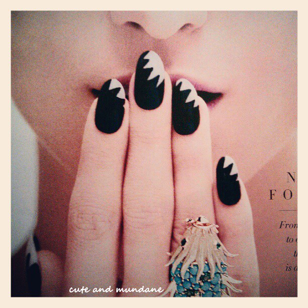
         I've been obsessing over the 'Shark Bite' manicure in the March 2013 issue of Harper's BAZAAR, as I shared earlier this week on Instagram (see here). The look was originally designed by CND's Kristina Eastbrooks for the Blonds. I love how it plays upon the black and white graphic look that's been trending in fashion this spring. (Plus, I've been secretly hoping for something to replace the nail-shortening Ruffian). I'm hoping to play around with this look myself; if I get the hang of it, maybe it'll make an appearance on the blog! In the meantime, here are five of my favorite reads this week, mostly pertaining to NARS, new launches, and New York Fashion Week (NYFW):

1. A pictoral history of the red lip on NYTimes.
2. Stunning colors, lines, and shapes in Narciso Rodriguez Fall 2013.  NYTimes slide show.
3. I'm swooning over Ommorphia's swatches of Butter London Spring 2013.
4. Say what? Essie is using 3,250 bottles of nail polish during NYFW and more at WSJ.
5. I've been admiring NARS And God Created the Woman on Will Work for Makeup.

         Thanks for reading! Would you wear the 'Shark Bite' mani? What makeup and/or fashion looks did you enjoy from NYFW? What new products are you looking forward to?

Love, Dovey.

Thursday, February 14, 2013

Allure Beauty Blogger Awards 2013 : Why you should enter!


          Last year by chance, I happened upon a tweet from Allure Magazine promoting a casting call for the first ever Allure Beauty Blogger Awards. It was late in the process, but I scrambled to put together an entry and hoped for the best. I was lucky to be selected as one of the fifteen finalists and take part in a whirlwind competition, during which I showcased my blog's Inspired by Art series and made my first ever video! At the end, I was chosen as a runner up winner. Allure flew me to NYC, where I took part in a photo shoot with the other two winners. We were featured in Allure's 2012 Best of Beauty Issue (see here)! It was a surreal experience, to say the least.

        Allure is now casting for the Allure Beauty Blogger Awards 2013! There's only a few days left to enter, but I'm posting this in hopes that I'll reach someone (like me last year) who hasn't heard about it yet. If you're thinking at all about entering, I would say just go for it! I think Allure is looking for interesting people and fresh voices--- and not necessarily the ones with the largest follower numbers, prettiest layouts, or longest experience. It's quick and easy to enter (find the entry form here). Just fill out the form and write a 150 word essay on why they should pick you as Allure Beauty Blogger of the Year. The deadline for submission is Tuesday February 19, 2013 11:59 PM ET. Good Luck!

Love, Dovey.

P.S. You can see all my Allure Beauty Blogger Awards related posts here.

Wednesday, February 13, 2013

Viktor & Rolf Flowerbomb Eau de Parfum review


          On Valentine's Day, love is in the air, quite literally. The romantic holiday is a heyday for fragrance; one can follow the crisscrossing scent trails of women wearing the perfumes that make them feel beautiful. To celebrate this very essential component of Valentine's day, I thought I would share a fragrance review... and what better perfume could I feature than Viktor & Rolf Flowerbomb Eau de Parfum?

          Viktor & Rolf Flowerbomb Eau de Parfum (2005) is a perennial favorite and front-pager in beauty departments' Valentine's Day displays. It's easy to see why; the elixir inside is easy on the nose and the packaging is both creative and beautiful. Drawing from its namesake, Flowerbomb is a pink liquid packaged inside a grenade shaped bottle embellished with a black wax-seal shaped 'pin'. It exudes femininity with a pinch of edge - a perfect fusion of marketing and design. However, does the appearance reflect the scent inside?

Notes: Bergamot, Green tea, Sambac jasmine, Centifolia rose, Freesia, Cattleya orchid, Patchouli
           Judging from its bottle and moniker, I expected Viktor & Rolf Flowerbomb to be a veritable explosion of fresh blooms (think a chorus of Rose, Lily, bluebells, pansies, etc. like in Alice in Wonderland's Golden Afternoon). However, Flowerbomb is actually a delicious 'floriental', with just a few choice flowers and a milky gourmand and patchouli base.

            Flowerbomb opens with a bright bergamot and tea burst that you have to be quick to catch. A light rose, with a little orchid added in for exoticism are the following act; however before they can bloom completely, the gourmand aspect of the fragrance seeps in and anchors them. The gourmand base is sweet and powdery with a little warmth. It smells almost vanilla-like, however I think somewhere between condensed milk and powdered milk would be a more apt description. There's a hefty dose of patchouli as well; normally it would be too much, but it's tempered via association with the gourmand. Sometimes I think I smell hints of chocolate, but it may be a sleight of mind due to the combination of patchouli and sweetness. Over time, the floral component transitions to a jasmine, though like the other blooms, it's grounded by the gourmand. I would say the scent is fairly steady from this point on; it wears for quite some time.


            Flowerbomb is often mentioned in the same breath as Thierry Mugler Angel (reviewed here), as both popular fragrances fall into the candied gourmand category (pioneered by the latter). They share a similar sweet gourmand base mixed with patchouli; I would say Angel's patchouli is a bit more potent. As I mentioned above, Flowerbomb has traces of a similar chocolate note that is more evident in Angel. However, Flowerbomb features a more traditional basket of powdery blooms, while Angel has a crazy cornucopia of fruits. Personally, I find Flowerbomb easier to wear.

            Viktor & Rolf Flowerbomb Eau de Parfum serves up a small bouquet of fragrant florals with a milky gourmand base and patchouli. It's a concoction that should please many noses. The fragrance is delightful and feminine, however it is not the explosion of blooms that the name and packaging suggest. (Perhaps 'Femme-bomb' would have been more appropriate, though not nearly as catchy). I was slightly disappointed since I'm quite fond of pure florals, however Flowerbomb can tickle my fancy when I'm in a sweet mood. (It pairs well with my sweet or foodie bath and body products!) Thanks for reading! Have you tried Viktor & Rolf Flowerbomb? Does it live up to the hype? What are your favorite 'florientals'?

Love, Dovey.

Monday, February 11, 2013

LUSH Valentine's Day 2013 review + photos

LUSH Tender is the Night Massage bar


        I can always count on LUSH for charming seasonal collections, and their Valentine's day collection is no exception. There a number of gift sets and single items that are certain to strike your (or a special someone's) fancy. I've tried and tested four limited edition pick-me-ups from the LUSH Valentine's Day 2013 lineup below:


LUSH From Dusk Til Dawn massage bar
1. LUSH Tender is the Night Massage bar ($7.95) has a relaxing and alluring vanilla, jasmine, and ylang ylang scent. The bar is aerated, and therefore very soft and easy to melt. The heart shaped bar can be crushed to reveal a melted almond oil, glycerine, cupuacu butter, and agave syrup concoction at the core. 
2. LUSH From Dusk Til Dawn massage bar ($7.95) is a more uplifting massage bar. It has Sicilian lemon, sweet wild orange oil, ginseng, and ginko to stimulate the senses. The firm texture is more like LUSH's regular massage bar line; the firm gold-capped cone shape is perfect for working into knotted muscles.


3. LUSH The Kiss lip gloss ($8.95) is the brand's first vegan lip gloss. I was pretty excited about this because some beeswax balms don't agree with my lips. LUSH This Kiss uses shea and cupuacu butters to moisturize and protect lips. The whipped texture is soft and melts to the touch. The almond and mandarin flavors and subtle pink tint are pluses as well!
4. LUSH Willow Pattern soap ($7.95)is a Sicilian lemon and rosewood scented soap.  The beautiful blue imprint on the soap cakes (the in-store version only, not online) was inspired by a traditional Chinese tale of star-crossed lovers. I love the gorgeous scent of this soap; I hope it makes a return appearance next year!  
LUSH Willow Pattern soap (online version, no pattern)
         I'm enjoying all four of these products from the LUSH Valentine's Day 2013 collection; they're perfect for sharing on Valentine's day, and will also get good use in the days beyond. These sweet treats are only around for a short time, so be sure to get your soon! Thanks for reading! Have you picked up anything from LUSH Valentine's Day collection? Which of the products appeals to you most? What was the last thing you tried from LUSH?

Love, Dovey.
Disclosure: This post contains product(s) sent to Cute and Mundane for consideration by PR. The ideas and opinions in this post are genuine and my own.

Saturday, February 9, 2013

Chantecaille Save the Sharks Palette review + swatches (Spring 2013)


          I first saw them on a grade school field trip to the National Aquarium in Baltimore - fearsome, majestic creatures with large toothy grins that seemed powerful enough to bite through the thick plexiglass wall that separated us. Seeing real live sharks for the first time is an experience I'll never forget. For all their scary looks and ruthless reputation, these top predators have much more to fear than we do. For every recorded shark attack on humans, humans have killed more than 4 million sharks. In the past 40 years, several shark species have been decimated by 95%. The demand for shark fin soup results in the deaths of 73 million sharks annually (that's over 2 per second!) Equally alarming is the brutality of shark fishing practices; fins are often cut off of a living shark and the body is thrown back into the water to die. Thankfully, there are organizations like the BLOOM association that are passionately committed to saving sharks. Among other accomplishments, BLOOM orchestrated a top-level ban on serving shark fin soup at all Hong Kong luxury hotels. Chantecaille is supporting BLOOM's tireless  efforts by raising awareness and donating 5% of proceeds from the Chantecaille 'Save the Sharks Palette' to the campaign.


          Last year I worked quite a dent into Chantecaille 'The Coral Reefs' palette (reviewed here); you can imagine how excited I was to get my hands on the Chantecaille 'Save the Sharks' palette! The palette casing is a light warm grey plastic with a very subtle blue sheen that can be seen in lower light or when observed at an angle. (You might be able to appreciate this 'blue' effect in the leftmost corner of the palette below). I thought this was pretty cool and very fitting considering the shark theme. A dark blue and white shark image and Chantecaille's logo is printed on the top.


         Inside the palette, each pan contains embossed three-dimensional imagery of a shark's fin slicing through the water. The golden or white over-spray on the fins is temporary and should rub off after a couple uses. There are three eye colors and one blush inside the Chantecaille 'Save the Sharks Palette'. Great White is a pale beige all-over or highlight eye color. Grey Reef is a shimmery golden pewter eye color.  Black Tip is a dark navy eye liner shade.   Sea Anemone is a beautiful bright pink. The powder eyeshadows and blush have good pigmentation and smooth application.


          Each of the palette's four colors has a marine animal inspiration. I've included a short blurb on each for your interest! The Great White shark is one of the largest (if not the largest) macropredatory fish; the largest measured great whites have approached (or exceeded) twenty feet in length and five thousand pounds in weight! Grey Reef sharks are often seen in shallow water near the drop-offs of coral reefs; they're small, agile, and aggressive predators less than six feet in length. Black Tip sharks are sharks that roam coastal waters of tropical and subtropical regions. They grow to roughly five feet in length and have a characteristic black streaks on the edge of their fins. Sea Anemone is the only non-shark namesake in the palette. Anemones are predatory animals with venomous tentacles; they also provide shelter to clownfish, who are unaffected by anemones' stings.


          Above, you can see a closeup of the shark icon on the Chantecaille 'Save the Sharks Palette'. Did you know that the dark upper side and light underside coloration of sharks is called countershading? Countershading helps the predator camouflage better with its surroundings. When seen from above, its dark upper side blends in with the deep sea. When viewed from below, the light belly blends in with the light surface of the water!


          I've made a few comparison swatches below, to give you a better idea of the colors in the Chantecaille 'Save the Sharks Palette'. I was particularly interested in the comparison of 'Save the Sharks' to last year's Chantecaille 'The Coral Reefs' palette (reviewed here). You can see that Chantecaille Great White is more beige and shimmery, while Chantecaille Pink Pearl is more matte and pink toned. Chantecaille Grey Reef is more grey than Chantecaille Reef. It's similar to Urban Decay Pistol (reviewed here); Pistol is more shimmery and golden, while Grey Reef is more mushroom toned. Chantecaille Black Tip is a more brilliant ocean blue when compared to the dark navy of NARS Mandchourie (right side, reviewed here). Chantecaille Sea Anemone is more pink and brighter than Chantecaille Coral, which has more orange tones.


          The Chantecaille 'Save the Sharks Palette' ($83) is a stunning deep sea (inspired) treasure! Needless to say, it's going to get a lot of love this season and beyond. Again, 5% of the proceeds will benefit BLOOM's efforts to ban the unregulated shark fin trade. The Chantecaille 'Save the Sharks Palette' and the rest of Chantecaille Spring 2013 can be found here at Chantecaille online and at select department stores. Thanks for reading! Which Chantecaille palettes are your favorites (e.g. elephants, reefs, tigers, turtles)? Have you tried anything from Chantecaille Spring 2013? What do you think of the colors in this palette?'

Love, Dovey.

P.S. Read more articles about the shark fin trade on NYTimes.
P.P.S. Be sure to check out my other Chantecaille Spring 2013 reviews (here and here)!
Disclosure: This post contains product(s) sent to Cute and Mundane for consideration by PR. The ideas and opinions in this post are genuine and my own. The Chantecaille link in this post is not an affiliate link; it is present for your convenience.

Wednesday, February 6, 2013

Chantecaille Luminous Gloss in Framboise and Pink Melon review + swatches (Spring 2013)

            Did you know that the model for all of Chantecaille's collections is Olivia Chantecaille, daughter of founder Sylvie Chantecaille? In the above photo, Olivia is modeling the gorgeous colors of Chantecaille Spring 2013. The Chantecaille Spring 2013 collection features a 'Save the Sharks Palette' accompanied by Chantecaille Lip Chics and Luminous Lip Glosses. In my last post, I shared my thoughts on Chantecaille Lip Chics in Framboise and Pink Melon (reviewed here).  Today I'll be reviewing Chantecaille Luminous Glosses in Pink Melon and Framboise.


         Chantecaille Luminous Glosses have delicious fruit inspired names; it's easy to see where Pink Melon and Framboise (French for 'Raspberry') get their inspiration from! The glosses apply smoothly and evenly; they have a flexible doe-foot applicator that is a bit flat and paddle-like. I like the finish of the glosses; they have a pleasantly balanced luster, avoiding the mirror ball shine you see in some glosses. The formula feels slightly tacky, but wears comfortably.


          Chantecaille Luminous Gloss in Pink Melon is a demure light pink that leans a little peach. Chantecaille Luminous Gloss in Framboise is a juicy raspberry pink gloss. Both have nice pigmentation when worn and don't settle into lip lines. You may have noticed that the Spring 2013 Chantecaille Luminous Gloss colors correspond well with their Lip Chic counterparts (reviewed here); in fact, they wear very nicely when used in tandem with the Lip Chics. I've swatched the Chantecaille Spring 2013 Luminous glosses alone, Lip Chics alone, and the two formulas combined below. While each color looks beautiful solo, the combination of Lip Chic with Luminous gloss produces a more intense color and shine. In the promotional photo above, Olivia Chantecaille is modeling the beautifully bright Chantecaille Rose Délice and Framboise combination. The combination with Chantecaille Daphne and Pink Melon is equally stunning.


          Both Chantecaille Luminous Gloss in Pink Melon and Chantecaille Luminous Gloss in Framboise ($34 for .26oz.) are gorgeous colors. Whether they're worn alone or in combination with a Lip Chic, you're sure to get a look that's trés chic! Both shades will be makeup bag staples for me this spring! Chantecaille Spring 2013 products are available at Chantecaille online as well select department stores. Thanks for reading! Have tried Chantecaille Luminous Glosses? What pieces are you loving from Chantecaille Spring 2013? Which of the two colors (Pink Melon or Framboise) do you prefer?

Love, Dovey.

P.S Stay tuned, there's more Chantecaille Spring 2013 to come!
Disclosure: This post contains product(s) sent to Cute and Mundane for consideration by PR. The ideas and opinions in this post are genuine and my own. The Chantecaille link in this post is not an affiliate link; it is present for your convenience.

Tuesday, February 5, 2013

Chantecaille Lip Chic in Rose Délice and Daphne review + swatches (Spring 2013)


             For me, Chantecaille's line has always represented the epitome of 'effortless chic'. Chantecaille Spring 2013, featuring their quintessential Lip Chics, Luminous Glosses, and a new 'Save the  Sharks Palette', is certainly no exception. I've been over the moon (or perhaps more appropriately under the sea) playing with these colors all week! Today I'll be sharing my review of Chantecaille Lip Chic in Rose Délice and Chantecaille Lip Chic in Daphne.


          Chantecaille Lip Chics are among my favorite lipstick formulas; they're comfortable, emollient, and shiny. The hybrid lipstick and gloss formula delivers smooth semi-sheer color with added collagen. Their Lip Chic formula also has good lasting power for a glossy lipstick. Chantecaille Lip Chics are packaged in shiny rounded gunmetal cases with Chantecaille emblazoned on the outside and a 'C' logo within.


            Chantecaille Lip Chic in Daphne is a light pink that leans slightly peach. Chantecaille Lip Chic in Rose Délice is a bright red pink. (Rose Délice is the color that Olivia Chantecaille is wearing in the Chantecaille Spring 2013 promotional photos). It's also worth noting that each Lip Chic has a corresponding Luminous Gloss color (Framboise and Pink Melon), both of which I'll review soon!


            I've made a few comparison swatches below to give you a better idea of the colors in Chantecaille Lip Chic in Daphne and Rose Délice. Chantecaille Lip Chic in Sunrise (Spring 2012) is more coral/peach toned than Daphne. NARS Mayflower lipstick is a little darker and more strawberry toned, while Daphne is more pure pink.  You can see how Chantecaille Rose Délice is more of a red-pink when compared to other bright pinks. Obsessive Compulsive Cosmetics Lip Tar in Anime (reviewed here) is a hotter pink, while Too Faced Fuschia Shock (reviewed here) is more fuschia toned, as per its namesake!


         Bottom line: I'm enamored with both Chantecaille Lip Chics in Rose Délice and Daphne ($35 for .07oz.). The formula and colors are wonderful, as one would expect from Chantecaille Lip Chics. With one bright pink and one light pink, I'm set for spring! The Chantecaille Spring 2013 collection is available at Chantecaille online as well as select department stores. Thanks for reading! Have tried Chantecaille Lip Chics? What pieces are you loving from Chantecaille Spring 2013? Which of the two colors (Rose Délice or Daphne) do you prefer?

Love, Dovey.

P.S Stay tuned, there's more Chantecaille Spring 2013 to come!
Disclosure: This post contains product(s) sent to Cute and Mundane for consideration by PR. The ideas and opinions in this post are genuine and my own. The Chantecaille link in this post is not an affiliate link; it is present for your convenience.

Saturday, February 2, 2013

Inspired by Claude Monet (Waterlilies, 1906)


            Welcome to my newest installation of Inspired by Art! For February, I found myself gravitating towards the watery blues and greens of Claude Monet's Waterlilies (1906). This particular work hangs in the Art Institute of Chicago, where you'll always find visitors (myself included) clustered around it, admiring the century old lilies. Monet's Water Lilies (or Nymphéas) paintings are among the most celebrated of his works.  They constitute a series of approximately two hundred-fifty paintings depicting the garden at Monet's home in Giverny, France during the last thirty years of his life.

          Monet and his large family moved to Giverny in 1880; during this time his fortunes improved considerably, as his dealer had increasing success selling Monet's paintings. In 1890, he bought a house and surrounding land for his gardens. Monet was an avid gardener; he drew up precise designs that he meticulously carried out with the aid of his family. In his later years, Monet hired as many as five gardeners to implement his ideas! As his fortune grew, his garden evolved as well. Though his garden paradise contained countless varieties of flowers and plants, it is now best known for the waterlilies, of which Monet said:

           "It took me time to understand my waterlilies. I had planted them for the pleasure of it; I grew them without ever thinking of painting them."


         The water, lilies, and reflected scenery form a beautiful continuum of purples, blues, and greens. To recreate Monet's Water Lilies in makeup form, I use cool hues softly blended together across the eyes. Too many colors may be difficult, given the 'canvas size' of a lid, so it may be easier to focus on one or two colors. (It's not necessary to literally recreate the painting!) For a more 'wearable' version of this look, I would suggest sweeping a light color across the lid and contrasting it with a saturated eyeliner. For example, a light lavender shadow adds a bit of effervescent flair when paired with a saturated marine blue eyeliner, while a pale blue wash accompanied by a dark, stem-green liner conveys an imperious elegance.


          I've chosen some of my favorite purples, blues and greens from my eye makeup collection to represent the lily pond in Monet's Waterlilies. Starting from the background, I created the red-purple shadows in the water using a blend of Urban Decay Fishnet and Urban Decay Freakshow. The lavender side of NARS Nouveau Monde was a nice match for the lighter purple tones in the pool, while the olive half channeled trees' shadowy reflections. I created the bright green of the lily pads using a mix of MAC Sour Lemon and MAC Plush. I used the dark green of MAKE UP FOR EVER Aqua Shadow in #8E to mimic the undersides of the lilies. MAKE UP FOR EVER Aqua Cream in #25 and NARS Outremer eyeshadow (reviewed here) can be blended into beautiful water tones.

          The bright lily flowers are focal points of Monet's painting. To celebrate the cool pink and red petals, I've chosen MAC Sunny Seoul lipstick (reviewed here), a spring pink, and MAC Heat Wave lipstick, an orange leaning red, from my collection. The former would be more subtle and the latter more daring. Both complement the aquatic tones beautifully. 

           In order to channel the reflections in the pool of water lilies, pick nail colors that mirror your eyes. Sephora by OPI Iris I was Thinner is an iris purple. Essie Lilacism is a light lavender. Essie Going Incognito is a dark leaf green. Sephora by OPI Ocean Love Potion is an aquatic blue-green. OPI What's With the Catitude? is a from-the-sky blue. Sephora by OPI Blue Grottois a deep underwater blue.

          The bold aqautic colors married with the soft impressionist strokes in Claude Monet's Waterlilies has provided me with vibrant inspirations for my makeup colors this February. On an optimistic note, the bright lilies emerging from the inscrutable waters are a cheery reminder that spring will soon surface from the depths of winter. I would love to visit Monet's colorful garden in Giverny one day; it's been preserved as a public museum. Until then, I'll experience Monet's countryside paradise through the sublime lens of his artistic vision. Thanks for reading! What colors are you wearing this February? Have you seen Monet's waterlilies in a museum, or perhaps in person?

Love, Dovey.

P.S. Be sure to check out more from my Inspired by Art series (here)!

Win It! Tatcha Ageless skincare collection GIVEAWAY! ($485 value)


** This Giveaway has ended!**
**Congratulations to Jess S., the winner!**

            To kick off the weekend, I have an absolutely amazing giveaway to share with you! One lucky Cute and Mundane reader will win the entire TATCHA Ageless skincare collection (a $485 value!). The products in the prize are listed below. I posted an in-depth review and photos of the new TATCHA Ageless collection earlier today; be sure to read what it's all about and join the discussion here. To recap, TATCHA is a luxury skincare brand inspired by a two-hundred year old book detailing the beauty secrets of geisha. East Asian rituals were combined with modern skincare science to create a beautiful skincare regime! You can check out TATCHA's facebook page and Twitter feed (@tatcha_v) to stay up to date with their latest products and news.

TATCHA Ageless Enriching Renewal Cream ($185)  
TATCHA Ageless Revitalizing Eye Cream ($135)
TATCHA Ageless Akari Crystal Massager ($165)
 
          This giveaway is open to Cute and Mundane readers with U.S. addresses only, as per the sponsor's wishes. Please enter using the Rafflecopter widget below. You can enter using either your facebook account or an email address. You can use a nickname if you like on the entry form, however I will ask for your full name for mailing purposes should you be the grand prize winner. Email addresses will not be visible to the public and I will only use them for the purpose of contacting the winner. You do not need to be a follower to enter, however, those who follow me via Google Friend Connect, Bloglovin', Twitter, and Facebook will be able to earn extra entries. Good Luck!

Love, Dovey

a Rafflecopter giveaway
Giveaway rules and information:  I will notify the winner via email. Each winner will have 72 hours to respond to my email with their mailing address; if there is no response, I will select a new winner. I will forward the address to the sponsor (Tatcha), who will be responsible for mailing the prize. I reserve the right to disqualify any entries. Reasons include (but are not limited to) false or ambiguous entries (a.k.a. not completing the task you said you did), multiple accounts for one person, and accounts suspected to be used solely for the purpose of 'giveaway hunting'. Significant alterations in the composition of the tweet entry may result in disqualification of that entry. Giveaway rules are subject to change without notice; however, if any changes are made, they will be updated in the blog post and widget.
Disclaimer: The giveaway prize will be provided and mailed by PR.

Friday, February 1, 2013

TATCHA Ageless Collection skincare review + photos


         Happy Friday! Today, I have an exciting post celebrating the new TATCHA Ageless Collection! TATCHA is a luxury skincare brand with a beautiful story. Founder Vicky Tsai found inspiration in a two-hundred year old book detailing the beauty rituals of geisha; she married these East Asian rituals with modern skincare science to formulate an East-meets-West beauty routine. The ritual is centered around TATCHA's trademark Hadesai complex, which consists of red algae extract, rice bran, and green tea extract. I've had the opportunity to experience a number of wonderful products from TATCHA; be sure to read my reviews of TATCHA's Normal Skincare Ritual (here), as well as the Water Collection (seen here). You can imagine my delight at receiving TATCHA's latest collection for review! (Oh, and I also have another set that will go to one lucky Cute and Mundane reader; details to follow!)
          TATCHA's Ageless Collection is the newest addition to the brand's skincare lineup. The Ageless skincare collection builds upon Tatcha's Hadesai complex, using Peony, Yokuinin, and Nindou extracts to increase microcirculation at the skin's surface. The increased circulation is thought to promote the revitalization of skin, and decrease premature aging.

           The Ageless collection consists of TATCHA Ageless Enriching Renewal Cream, TATCHA Ageless Revitalizing Eye Cream, and Akari Crystal Massager (not shown). The packaging is, of course, stunning! Tatcha's line is encased in dark wood printed boxes with handmade paper scrolls within (see here). The original skincare line is a ceramic white, however you can see that the Ageless collection is colored a serene sea blue with dark blue and gold detailing.


          The TATCHA Ageless Enriching Renewal Cream is a pale pink cream housed in a weighty plastic jar. The cream has a rich texture with some gel-like slip. Typically, I pick up a small amount with one finger and strategically dot it over my face before massaging it in. Almost immediately I can feel the slightest warmth in my face, a possible manifestation of the increased micro-circulation. The cream comforts and hydrates skin; it sinks in, but also leaves a protective layer that lasts overnight, much like TATCHA's original cream. (I can feel it when I wash my face the next day). This facial has TATCHA's gorgeous signature scent, which smells to me like sweet rice water and flowers.

          The TATCHA Ageless Revitalizing Eye Cream is also colored a whisper pink; the eye cream is packaged in a broad based glass jar. The texture is quite thick, but retains enough slip to work easily over the skin surrounding eyes. The eye cream leaves an even more protective layer than the facial cream. There is a scent, but it's appropriately fainter than TATCHA's other facial products.


          Overall I really enjoyed my TATCHA Ageless Collection experience. It's nice to see an eye cream added to TATCHA's lineup, and the added benefits of their newest facial cream sound promising. Both products convey luxury with impeccable feminine detailing and a delightful fragrance. The texture is wonderful and my skin seems to be content with the added protection. You could say I'm one happy beauty blogger! TATCHA Ageless Enriching Renewal Cream ($185 for 1.7fl.oz.) and TATCHA Ageless Revitalizing Eye Cream ($135 for 0.5 fl.oz.) are available at Tatcha.com, as well as select Barney's New York locations.

          Thanks for reading! Have you experienced TATCHA? What are your favorite products? Do you prefer the new sea-blue or original ceramic white packaging?

Love, Dovey.

P.S. Check back soon, because I have an amazing TATCHA Ageless Giveaway planned for this weekend!
Disclosure: This post contains product(s) sent to Cute and Mundane for consideration by PR. The ideas and opinions in this post are genuine and my own.